Find and Fix Your Biggest Downtime Losses
Most downtime projects don't fail for lack of effort. They fail in one of two places.
Either the numbers aren't trusted, so every meeting starts with an argument about whether the data is right. Or the numbers are accurate but they don't point anywhere: poorly defined reasons with no clear actions to take.
To reduce downtime, two things have to be true at once. The real losses must be captured accurately, and the way those losses are assigned to reasons must line up with actions someone can take. Miss either one and the effort goes nowhere.
This playbook walks through both, and then the part that makes it stick: trending losses by root cause so improvements can be held to account over time.
Step 1: Make capture automatic
If downtime is recorded on paper, or typed in from memory at the end of a shift, it will never be fully trusted. Not because anyone is lying. Operators have a job to do, and that job isn't data entry. Short stops go unrecorded, times get rounded, and the reason written down is the easy one rather than the right one.
The damage isn't just inaccuracy. It's what the inaccuracy does to everything downstream. The first time someone in a review meeting credibly says "that figure's wrong", the whole dataset gets discounted. From then on, every conversation about downtime is really a conversation about the data, and the improvement work never starts.
So the capture of the loss itself, when the machine stopped and for how long, needs to come straight from the machine. No human input. Humans are for the why; machines are for the what and when. That division of labour is the fix.
And this doesn't need a big engineering project. The technology to do it already exists: modern machines can report stops directly from their control system or PLC, and older machines can be retrofitted with low-cost industrial IoT sensors that detect whether they're running. Machine age isn't the barrier it used to be. If it has power, its downtime can be captured automatically.
One thing to be honest about: automatic capture will surface more downtime than the paperwork ever did. Usually a lot more, because all those unrecorded two-minute stops add up. That's uncomfortable in the first few weeks. It's also the point. You can't reduce what you can't see.
Step 2: Assign reasons at the machine, at the time
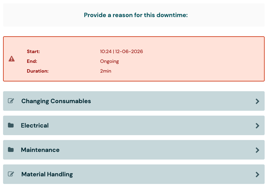
The machine knows it stopped. It usually doesn't know why. That part comes from the operator, and the way you ask matters.
Ask at the machine, at the time of the stop (or shortly after), with a short structured list to pick from. Don't ask at the end of the shift, from a form, from memory. A reason assigned two minutes after a stop is an observation. A reason assigned six hours later is a guess.
Keep the interaction quick. If assigning a reason takes longer than a few seconds, operators will reasonably deprioritise it, and you're back to untrusted data.
Better still, when the machine does know why, don't ask at all. Fault codes and alarms from the control system can assign some reasons automatically, and even a retrofitted sensor can catch common ones, like an e-stop being pressed. It won't cover every stop, but each reason assigned automatically is one less interruption for the operator. Taking load off the operator should always be the goal.
Step 3: Structure the reason tree for action
This is where most downtime setups quietly go wrong. It's very easy to be either too high-level or too granular, and both ends seriously hamper the search for root causes.
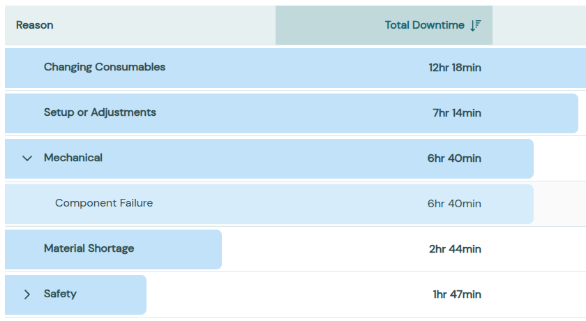
Too high-level looks like a reason list of "Mechanical", "Electrical", "Operational" and "Other". The Pareto chart tells you nothing you can act on, and "Other" quietly becomes the biggest bar.
Too granular looks like hundreds of leaf reasons in a flat list. Operators scroll, pick something close enough, and assignment gets sloppy. And even when assignment is good, every individual reason is too small on its own to justify doing anything about it.
The answer isn't to pick the right single level. It's to keep the full hierarchy, for example Mechanical Issues -> Motors -> Blown Fuse, so problems can be navigated from the top down. But within that hierarchy there must be a level at which losses group into something one action can address.
Here's the test for whether your grouping is right: can you make statements like "by adding one preventative maintenance check, we tackle 14 hours a month of downtime in one go"? If no level of your tree lets you say something like that, the tree is structured for reporting, not for action. Restructure it.
The practical way to get there is to build the tree from the actions you could plausibly take: maintenance checks you could add, changeover steps you could standardise, material supply problems you could fix. Not from an equipment taxonomy. And treat the tree as a living thing; review it every few months as the losses shift.
Step 4: Weight the losses by where they happen
A Pareto chart ranks reasons by size. But the biggest bar isn't automatically the most expensive one.
Every plant has a constraint: the machine or step that sets the pace for everything else. An hour lost there is an hour of output lost for the whole plant, and you never get it back. An hour lost on a machine with spare capacity might cost you almost nothing, because it can catch up.
So before committing to attack the biggest reason, ask where those hours are being lost. A modest downtime reason on the constraint is often worth more than a much bigger one somewhere with slack. Ranking reasons by hours is a start; ranking them by lost output is the goal.
Step 5: Trend by reason and give each one an owner
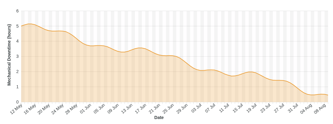
A Pareto snapshot picks the target. The trend proves whether the fix worked. This is the step that turns downtime analysis from a reporting exercise into an improvement loop.
Once losses are captured automatically and grouped at an actionable level, you can put a line on a chart for each reason and watch it over months. And that changes the conversation, because now improvement claims are testable: "you said adding that maintenance check would fix the motor failures, let's see if it's actually helped over the last three months."
That sentence is the payoff of everything above it. It only works because the capture is trusted (nobody can dismiss the line), and because the grouping matches the action (the line measures exactly the thing the fix was meant to move). Give each of your top reasons a named owner and a review date, and the accountability takes care of itself.
What good looks like
When all of this is in place, the downtime review meeting changes shape. Nobody debates the numbers, because nobody entered them. The discussion starts at the actionable level of the tree, not at "Mechanical". Each big reason has an owner, and the first item on the agenda is last month's claims against this month's trend lines.
That meeting is short, slightly uncomfortable for whoever's line hasn't moved, and more useful than any amount of paperwork ever was.
If you'd like to see what this looks like running on your own machines, get in touch below and we'll show you.